UI Guidelines
These guidelines serve as a reference for developers building Digital Blueprint (DBP) applications. They define how components and layouts must be implemented to ensure a consistent, accessible, and reproducible user experience across all apps. Topics are organized according to the table of contents.
App Shell
The App Shell is the outermost structural frame of any DBP application. It loads before any activity content and provides the consistent layout within which all activities are rendered.
The App Shell consists of three main structural components:
- Header
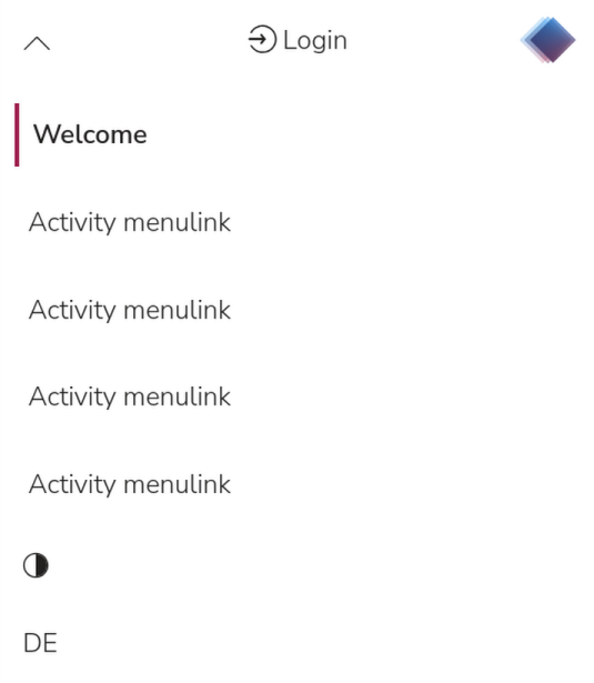
<header>- Contains the main navigation elements [Fig. 1] - Side Menu
<aside>- Contains the activity navigation links [Fig. 3] - Main Content Area
<main>- Renders the current activity content [Fig.4]
App Shell Behavior
Loading State
The App Shell renders first, providing immediate visual feedback while activity content loads asynchronously.
Responsive Behavior
- Default layout uses the full App Shell with a maximum content width of 1400 px.
- At viewport widths of 870 px and below, the application automatically switches to the wide layout.
Theme Support
The App Shell supports theming via CSS custom properties (CSS variables). All App Shell components use the same variables as the rest of the application to ensure visual consistency.
- A mode toggle
 in the main navigation is provided for theming
 - Custom themes are implemented by overriding the CSS variables. See the theming documentation for a full list of available variables.
Navigation
Top Navigation

The top navigation [Fig. 1] is placed in the slot "header" <header>. It is centered horizontally and contains the following elements:
- Menu toggle: opens the
<aside>side menu and switches between standard layout and wide layout - Dark/Light mode switch
- Language switch (EN / DE)
- Login / Logged-in user indicator
- Application logo
Side Menu

The side menu <aside> lists the available activities of the application [Fig. 2].
- The active activity is displayed in bold and highlighted with a red vertical line on the left edge.
- Inactive activities are displayed in regular weight without a marker.
Responsive behavior of the top navigation:
The following breakpoints govern responsive navigation behavior:
- At 1100 px and below, the
<aside>side menu collapses into a dropdown that slides in from the top of the screen Fig. 3. - At 490 px and below, the contrast switcher and language switcher move inside the dropdown to free space for the login name in the center Fig. 3.
Activities
Structure of an activity
Every activity [Fig. 4][Fig. 5] must follow this fixed structure:
- The slot "headline" always contains:
a.<p>the app shell title (app name) rendered via the appshell title slot name="title"
b.<h1>the activity title. Activities must be named with a verb, as this communicates that it is an action the user can perform. <h2>optional heading for introduction or section separation- Optional introductory text providing an overview of the activity
- Activity content


UI Flow
All UI flows follow one of two patterns. The appropriate pattern must be chosen based on the nature of the activity.
Informational views
In information views, all UI elements are of equal weight. The user decides independently what to do next. All buttons are equivalent (Secondary Button) Fig. 10. The user is not guided through a defined sequence. Example: Clipboard Management activity.
Click-through flow
In a click-through flow, the developer defines the steps required to proceed. A primary "call-to-action" button [Primary-Button] [Fig. 11] always marks the next step. See the Buttons section for placement rules.
Layout and Grid System
The DBP app supports two layout types, Standard Layout and Wide Layout, that the user can switch between by opening or closing the side menu. If the user closes the side menu, or if the viewport width drops below 1100 px, the application automatically switches to the wide layout across all activities. The selected preference is stored in local storage and persists across browser sessions.
Layout Types
The DBP app supports two different layout types (Standard layout/ wide layout) that users can switch between opening the menu
 in the main navigation. The menu is opened per default. If the user closes it, or if the viewport width drops below 1100px, the layout automatically switches to the wide layout across all apps.
The app shell stores the selected preference in local storage, ensuring it remains consistent when the browser is reopened.
Standard Layout
- Default layout for all apps in desktop view down to a viewport width of 1100 px [Fig.6].
- The side menu
<aside>is positioned on the left side of the screen. - The main content area
<main>occupies the remaining space and contains the active activity. - Optimized for navigation-heavy workflows where frequent access to the side menu is required.

Wide Layout
Default layout at viewport widths of 1100 px and below [Fig.7].
The side menu <aside> collapses into a dropdown positioned at the top of the screen. An icon + label in the top-left corner of the header opens this menu.
The main content area <main> spans the full width below the <aside> navigation [Fig.7]
Optimized for content-heavy workflows requiring maximum screen space, such as the Cabinet filter view, or for use on small laptop screens.

Maximum Content Width
The maximum content width is 1400 px. This limit applies regardless of whether the standard or wide layout is active. It prevents text lines from becoming too long to read and stops elements within
Mobile XS (320px smallest viewport)
As one implement responsive design in apps, one has to check some elements for this breakpoint as the h2 tends to be too large for this view, regarding long words.
DBP currently tries to target "iPhone SE 1st gen" as the lowest supported (CSS) resolution: 320 x 568
See https://www.ios-resolution.com, https://www.mydevice.io/#compare-devices and https://en.wikipedia.org/wiki/IPhone_SE_(1st_generation) for more information.
UI Elements
Icon Library
DBP uses the icon set from https://lineicons.com/, which is license-free.
Icons
Icons in the DBP app are classified into three categories based on function and interaction type:
- Decorative icons: visual aids only, no interaction required
- Interactive icons: standalone clickable elements used only when there is insufficient space for an icon + text button (e.g., in data tables [Fig.14] or mobile views)
- Buttons with icon + text: the default and preferred form for all interactive actions
Color of Icons
Icons have to be set in the var(--dbp-on-secondary-surface) color. Only the closing icon in modals is set with the color: var(--dbp-accent).
Decorative Icons
Decorative icons are not interactive and are therefore optional. If used, they must appear before a heading. Their size is determined by the font size of the associated heading. There are no restrictions on icon complexity for decorative use.
Icon Selection for Buttons
The correct icon for a button is determined by the verb in the button label. For example, a button labeled "Edit mode" uses a pencil icon because the verb is "edit." Once an icon has been assigned to a verb, that icon must be used consistently for the same verb across all apps.

If two buttons with the same icon would appear near each other, a new, distinct icon must be selected for one of them to avoid ambiguity.

Buttons with Icon + Text
All interactive buttons must consist of an icon and a label text. The icon size inside a button is 22 x 22 px.
The label text describes the action using a verb, optionally followed by a noun for specificity. Buttons without icons are not permitted. Button labels always start with a capital letter.
When implementing icons, always include appropriate alt text or aria-attributes such as aria-hidden="true" to ensure accessibility. Icon sizing and styling must remain consistent throughout the application.
Interactive Icons
Interactive icons are used only when there is not enough space for a full icon + text button. Typical contexts are data tables and mobile views. See also: Buttons with Icon + Text.
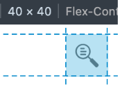
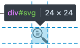
Icon Size
Inside buttons, icons are 22 x 22 px. When icons appear without a surrounding button (standalone interactive icons), the following sizing rules apply:
- The touch target must be at least 40 x 40 px.
- The icon itself must be between 22 x 22 px and 24 x 24 px, depending on the legibility of the symbol.
Buttons
Every button consists of an icon and a label text. The label text describes the action using a verb, optionally followed by a noun for specificity. Buttons without icons are not permitted. Button size is determined by a padding of 4 px (top/bottom) and 13 px (left/right), plus the length of the label text. If multiple buttons in a group occupy too much horizontal space, all buttons in that group collapse to icon-only. For icon sizing rules, see (icon-size)
Single Button
A single button is aligned to match the text alignment of its containing section. For example, a button in a left-aligned text block is placed left-aligned. Exceptions apply in visually bounded areas such as modals, where a single button is placed to the right by default. See (modals) for modal-specific placement..
Button Groups
Button groups may consist of buttons and text elements. Text elements within a button group must be treated as buttons for alignment purposes.
When multiple buttons are present, they are distributed evenly across the full width of the section. Buttons with related functions may be combined into a logical group (a single <div>). That grouped element is then distributed evenly together with any standalone buttons. [Fig.10]

Primary Button
CSS classes: "button and is-primary". The primary button always marks the next step or
call-to-action in the UI flow. In a Click-through flow, the primary button is placed at the far right. [Fig. 23]

Secondary Button
CSS classes: button and is-secondary.
The secondary button is used for all actions that are not required for the main process flow. [Fig. 10]

Tertiary Button
CSS classes: button and is-tertiary".
The tertiary button is used for reset or clear actions (e.g., clearing search fields or filters) [Fig. 13]

Buttons in Responsive Web Design
In mobile view, buttons remain in their icon + text form unless there is insufficient space. If space is insufficient, buttons collapse to icon-only. In all other cases, buttons with icon + text expand to full width.
Tables
DBP distinguishes between two table types: tables with fixed content [Fig. 14] and data tables [Fig. 16]. The choice depends on whether the column structure is known in advance. Depending on the use case, either endless scroll or pagination may be used. Endless scroll is used in the Nextcloud File Picker web component. Pagination is used in Formalize. All tables are built using the tabulator library.
The entire table uses a three-column structure: left, center, and right [Fig. 14].
In case of a data table [Fig. 16], the left and right columns are frozen (sticky) and remain visible at all times. The center section contains the variable data columns and scrolls horizontally, sliding beneath the sticky columns.
- Left column: checkbox and row ID.
- Right column: optional column settings icon in the table header row; icon-only row action buttons in data rows.
Tables with Fixed Content
Tables with fixed content [Fig. 14] are used when the number and relative weight of columns is known in advance. Because column weights are defined, specific columns can be collapsed on smaller devices [Fig. 15]. Collapsed columns can be expanded again by the user. The collapse/expand control is a chevron icon placed in the first column of the affected row [Fig. 14].


Data Tables
Data tables [Fig. 16], [Fig. 17] are used when the number or weight of columns is unknown, or when a large volume of data is expected. Because column widths cannot be predetermined, no columns can be collapsed. Instead, the table body scrolls horizontally. The table has a three-column structure: a frozen left column, a scrollable center section, and a frozen right column. The left column always contains a checkbox and a row ID. The right column is always visible and contains an optional column settings icon in the table header and icon-only row action buttons per row. One of the row actions is always a preview icon that opens a detail modal for the selected row.

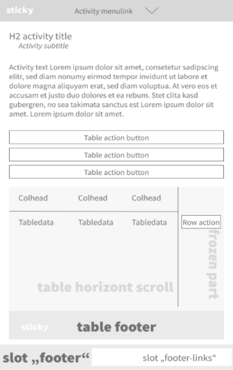
Table Title
The table title uses an <h3> tag. An <h2> heading must appear before it in the document hierarchy for accessibility compliance. If no <h2> is present in context, the table title tag must be changed accordingly.
Table title styling: font-size: 1.17em; border-bottom: 3px solid var(--dbp-primary).

Table Actions
Table actions are displayed as buttons above the table. Each button opens a dropdown menu listing the available actions [Fig. 18]. Actions apply to the entire table unless one or more rows are selected, in which case the actions apply only to the selected rows.
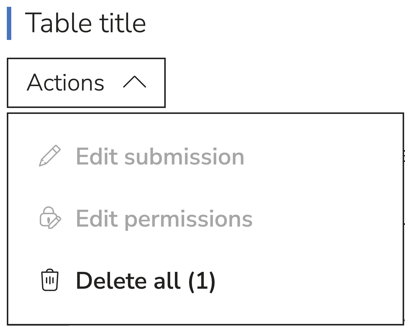
Table Searchbar
The search bar in the table is a magnifying glass icon that can be expanded to reveal text search and advanced search parameters. The advanced search options allow you to narrow down your search by column name and operators.

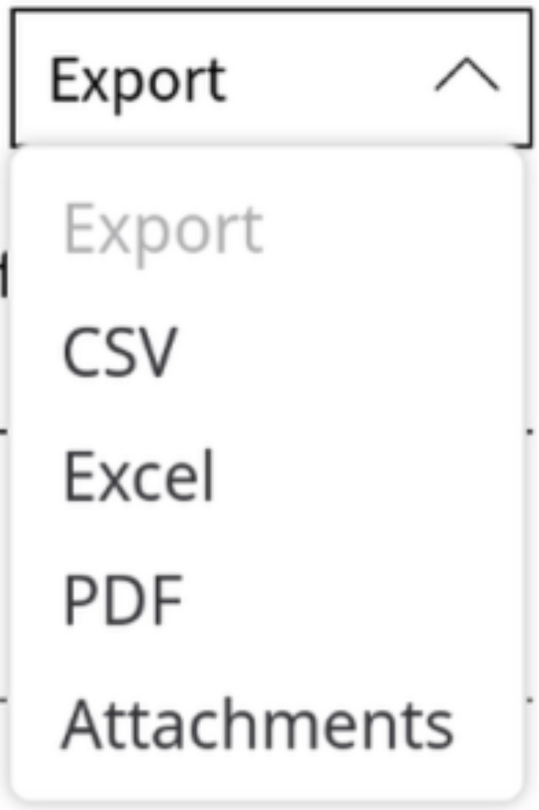
Export Dropdown
An export button is placed at the far right of the table toolbar. It opens a dropdown with available export format options See Fig.20.
Row Counter and Search Reset
By default, "n shown" (See [Fig. 14], [Fig. 16]) is displayed next to the entry count selector. When rows are selected, "n selected" is appended to the string. "Reset search" is disabled by default and becomes active only after the user has interacted with the search controls.
Rows and Row Actions
Each row has its own set of action icons placed in the right column. These row actions target only the individual row and are rendered as icon-only interactive elements. One row action is always a preview icon that opens a modal with a summary of the row data.
Table Footer
If a table contains more than 10 entries, pagination controls are displayed centered in the footer (pagination must be activated). The footer includes: current page indicator, navigation buttons for Next, Previous, First, and Last. On mobile devices, the footer is fixed to the bottom of the table.
Modals
Modals are built using the <dbp-modal> component. Three types are distinguished: Detail Modals [Fig. 23],
Modals with Tabs [Fig. 24], and Modals with Subtabs [Fig. 25].
Modal Header Slot
The
1. Default header [Fig. 21].
<h2>small (font-size: 1em), light-weight title- Close icon (X) in the top-right corner

2. Advanced header [Fig. 22].
- Icon +
<h2>large, bold title - Close icon (X) in the top-right corner

Detail Modal
A detail modal is used to display a complete data record or to provide additional detail. The modal title is in the upper-left corner and the close icon is in the upper-right corner [Fig. 21][Fig.22]. Action buttons are positioned sticky at the bottom of the modal.
Example usage: Formalize uses the detail modal to display a complete form submission entry.

Modal with Tabs
When a modal requires sub-navigation (e.g., switching between different storage locations for files), tabs are added to the modal. Tabs are placed on the left side of the modal on desktop [Fig.24]. On mobile devices, tabs move to the top of the modal beneath the modal header. The modal title indicates the context of the dialog. A close icon is placed in the upper-right corner. Example usage: file handling webcomponents.

Modal with Subtabs
Subtabs provide a second level of navigation within a tab. Subtabs are placed in the header area of the tab content. On mobile, the primary tabs appear above the subtabs to maintain a clear navigation hierarchy.

X and Cancel Buttons
Every modal includes a close button labeled "X" in the upper-right corner. This button closes the modal without making any changes. If the modal requires user input (e.g., overwriting a file, saving a filter), it must include both a "Cancel" button and a "Save" / "Apply" / "OK" button. The "Cancel" button behaves identically to the "X" button: it stops the active process and closes the modal without applying any changes. The "Save" / "Apply" / "OK" button commits the changes and closes the modal. If the modal is informational only (e.g., a preview or directory selection), a "Cancel" button is not required. An optional "OK" button may be added to confirm that the user has acknowledged the information.
States and Interaction Design
Hover State
The CSS variable var(--dbp-override-hover-background-color) is declared on all interactive elements that support a hover color. Whether the hover effect is visible depends on the active theme and needs to be declared if a hover color is preferred.
No specific hover appearance is prescribed for any individual interactive element. Elements are designed to communicate their interactivity through their default appearance: buttons look like buttons, links are underlined.
Active State
The active state is always indicated by the var(--dbp-accent) color and font-weight: bold.
The inactive counterpart uses font-size: 0.85rem.
- Active activities in the side menu and active subtabs are highlighted with bold text and a vertical accent-colored line on the left edge. [Fig.26]
- Active tabs display colored icons and bold text [Fig.27]. Same applies for active subtabs [Fig.28].


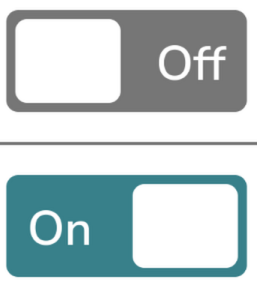
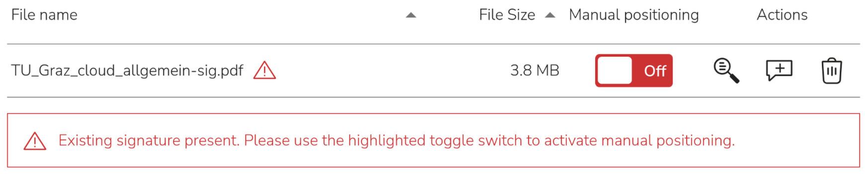
Toggle switches are off by default, using the var(--dbp-muted) color. When activated, the color changes to var(--dbp-info).
Focus
No custom focus style is currently defined. The browser default focus indicator is applied. A more prominent focus style is recommended for future implementation to improve accessibility, particularly in high-contrast contexts.
Disabled State
Disabled elements are rendered at opacity: 0.5. They remain visually recognizable but are not interactive. This applies to buttons and links that are temporarily unavailable.
Example: In Formalize, the submission button remains disabled until all required fields have been completed.

Loading State
A spinning icon indicates that a loading process is in progress. It does not communicate the expected duration. The spinner provides visual confirmation that the system is processing the user's request.
See also: Toolkit-Showcase > Mini Spinner
Feedback
Because no hover state is specified, the primary feedback for user interaction is the completion of the triggered action itself: A new window opens, a modal closes, or a result is displayed. The successful execution of the action serves as the feedback signal.
Error Handling
Notification are built using the <dbp-notification> component. They are displayed at the top of the screen by default to communicate information, success, status updates, or errors. The placement can be also changed (Eg. Within a modal).
The notification width can be customized per app by setting the --dbp-notification-max-width CSS variable on the dbp-notification host element, e.g. ".my-app dbp-notification { --dbp-notification-max-width: 20rem; }".
Notifications can be dismissed manually via an "X" button and may include a countdown timer that can be configured as needed.
Errors may also be displayed within a notification banner. In this case [Fig.31], the banner includes a clear error message and the relevant contextual data.
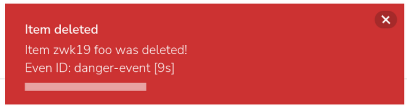
Every error outside of a notification banner must include a meaningful error message and the warning-high.svg icon
in the color var(--dbp-danger-surface-border-color).
Animations
The DBP app uses a small set of functional animations. All animations serve a specific purpose, communicating state changes or system processes, rather than being purely decorative.
Toggle Switch Animation
When the toggle switch changes between On and Off states, the toggle knob slides smoothly to indicate the transition. See [Fig.29] for the two states.
Modal Animation
Modals open as popup overlays without a transition animation. They appear instantaneously.
Responsive Side-Menu Animation
In responsive layouts, the side menu (e.g., the Cabinet filter panel) slides in from the left edge of the viewport as an additional panel. After the user has applied filters, the panel slides back out of the viewport when closed via the X button.
Loading Animation
The spinning icon used to indicate loading processes is classified as an animation element. It provides continuous visual feedback during wait times.
Colors
DBP apps define colors exclusively via CSS custom properties (CSS variables).
Hard-coded color values and hard-coded border colors must not be used.
A complete description of the color system and available variables is provided on the theming page.
CSS variables are accessed using the var() function.
All CSS variables can be used in component code without the "override" prefix. Example:
.any-selector {
  color: var(--dbp-accent);
}
Variables with the prefix override are intended for integrators and must only be set in the index.html.
Values set in index.html with the override prefix propagate to the corresponding internal variables
(without the prefix). This mechanism allows multiple themes to be mapped to a single variable set, and
enables components to use variables internally without the override prefix.
For reference on CSS custom properties, see developer.mozilla.org.
Heading Hierarchy
The DBP app uses a defined typographic hierarchy. Each heading level has a specific purpose and must be used accordingly. The following rules apply:
Use semantic HTML elements (<h1> through <h6> and <p>) for correct document structure and Accessibility.
- Do not skip heading levels.
- Use rem/em values instead of px values.
- Apply line-height: 1.5 for body text and line-height: 1.2–1.3 for headings.
<h1>
The <h1> tag is used exactly once per page and represents the active activity name.
The only exception is the welcome page, where the application name is displayed as <h1> instead of an activity name.
<h2>, <h3>, <h4>
The <h2> tag is used in the content area of an activity whenever a new section or segment requires a title.
Every subdivision of <h2> content must use <h3>, every subdivision of <h3> must use <h4>, and so on.
Heading levels must not be skipped.
Typography Size Table
| Element | px | rem/em | Usage |
|---|---|---|---|
| H1 | 32 | 2 | Site title only |
| H2 | 24 | 1.5 | Activity names, major section titles, modal titles, hitbox titles |
| H3 | 18.72 | 1.17 | Content section titles, filter section names, modal section titles, table titles |
| H4 | 17.6 | 1.1 | Subsections, important content groupings like in modals (cabinet) |
| H5 | 16 | 1 | Minor section titles, emphasized text |
| H6 | 16 | 1 | Minor section titles, emphasized text |
<p> |
16 | 1 | Body text, general content |
Typography Styling
All headings in the content area (<h1> through <h6>) use font-weight: 300 (Light).
In modals, all headings, including table headings, must use font-weight: 600 (Semi-bold).
See [Fig.16] (Data Tables). Semi-bold must also be applied whenever contrast with adjacent body text
is needed, for example for labeled data in lists in Cabinet App[Fig.33].

Accessibility Guidelines
Regarding design and structure, you must ensure WCAG 2.1 AA compliance for all DBP applications. The following accessibility requirements are mandatory for all UI implementations. For detailed guidelines, refer to the Accessibility guide:
Table of Content: